
How to Look at a Sam Gilliam Painting: With One Eye on History and the Other on Color and Form
Here’s an old question that I find is still alive for a lot of
people: How do you look at an abstract painting? Are you meant to
just immerse yourself in the wordless presence of its colors? Or
does it tell a kind of story too—about its author’s ambitions,
about its place in art history, about ideas of painting itself—that
you are meant to enter into as well? How does it speak to you?
Sam Gilliam is certainly an artist who lends himself to wordless
immersion. Now in his late 80s, the artist has a storied history,
becoming the first African-American artist to represent the US at
the Venice Biennale, in 1972, and winning the Presidential Medal of Arts in 2015. But he
has been having a major moment
lately, and if you’d like to contemplate why, Dia:Beacon has
just unveiled a permanent
gallery dedicated to him at its upstate temple of
Minimalism. Its centerpiece is the ambitious, gallery-swallowing
Double Merge (1968).
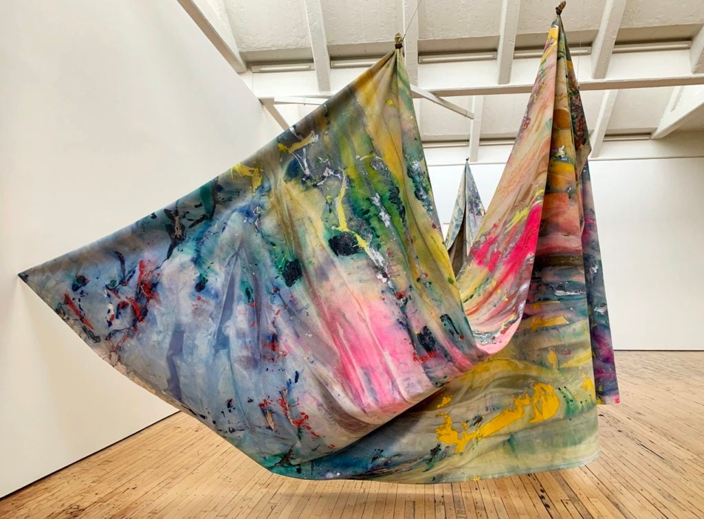
This is one of the first of Gilliam’s signature “Drape”
paintings—abstract painted panels that are then loosely hung from
the wall, often at ambitious scales. Above all, these are lovely
choreographies of paint and canvas, impressive presences.
Double Merge is almost nostalgic to me in its tonic faith
in the direct pleasures of color.
But there’s also more to get out of it. In their deep structure,
Gilliam’s works are animated by a story too. Their specific
dynamism condenses something about the historical moment when
Gilliam had his inspiration for them, the late ‘60s—exactly when
people were asking more of abstraction.
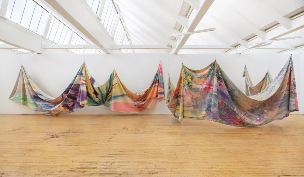
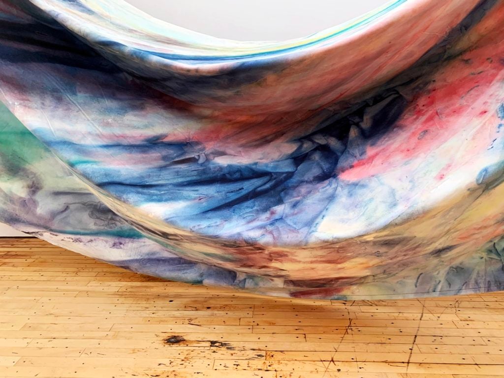
Sam Gilliam, Double Merge (1968).
Installation view, Dia:Beacon, Beacon, New York. © Sam Gilliam.
Photo: Bill Jacobson Studio, New York, courtesy Dia Art
Foundation, New York
Double Merge consists of two large, loose canvas
panels, one suspended at four points along the wall, the other
suspended from six and made to bulge into the gallery as if
creating an enclosure. In both, the fabric droops in a series of
folds that nearly brush the floor, evoking kingly robes or theater
curtains.
As for the surfaces, you see sweeps of thin lavender, green,
pink, yellow, and sherbet orange, occasionally interrupted by a
short, sharp ribbon of a darker red or a splash of hard, metallic
silver.
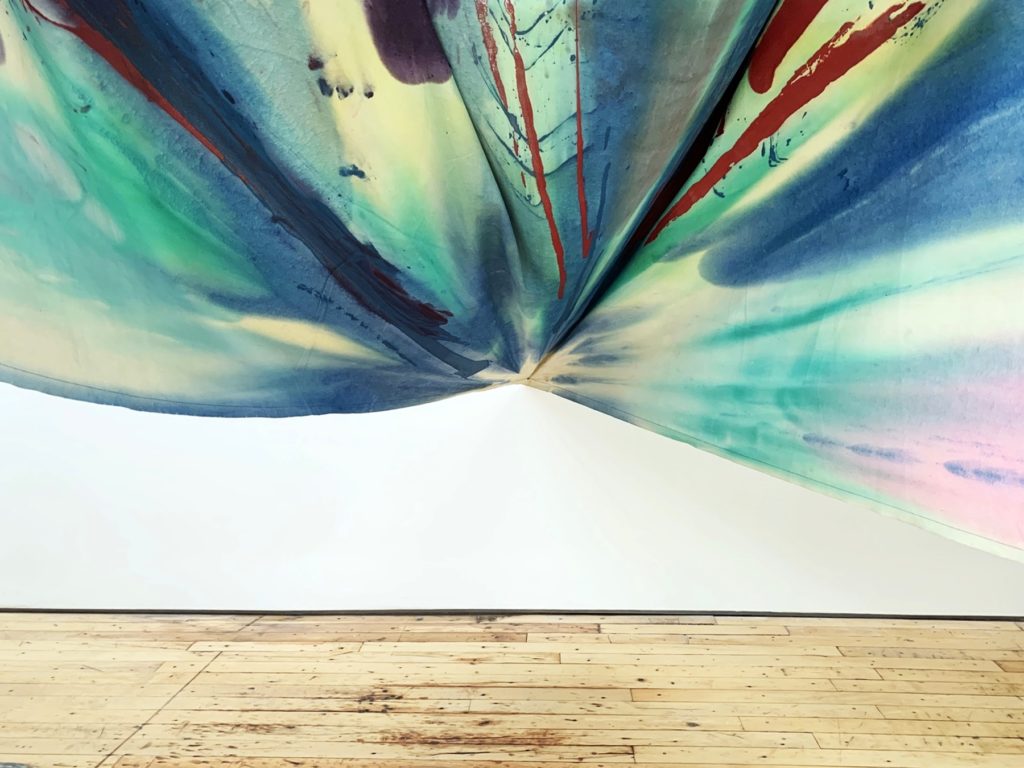
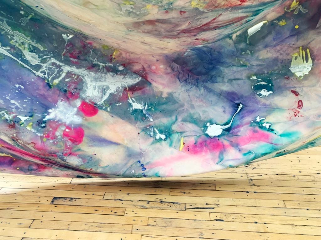
Detail of Sam Gilliam, Double
Merge (1968). Image: Ben Davis.
Sometimes the way the fabric is gathered together seems to
concentrate the patterns of paint into starbursts or explosions.
Other times the folds in the draped canvas seem to cut against the
sense of motion implied by the painting on its surface, bluntly
counteracting any illusionary ethereal atmosphere with a reminder
of real gravity, real mass.
These contrasts and tensions play out along the length of
Double Merge at a beat-by-beat, foot-by-foot level.
Gilliam has talked of adding the tension between sculptural and
pictorial qualities to the familiar “push and pull” of color in
traditional abstract painting (coming out of the pedagogy of Hans
Hofmann).
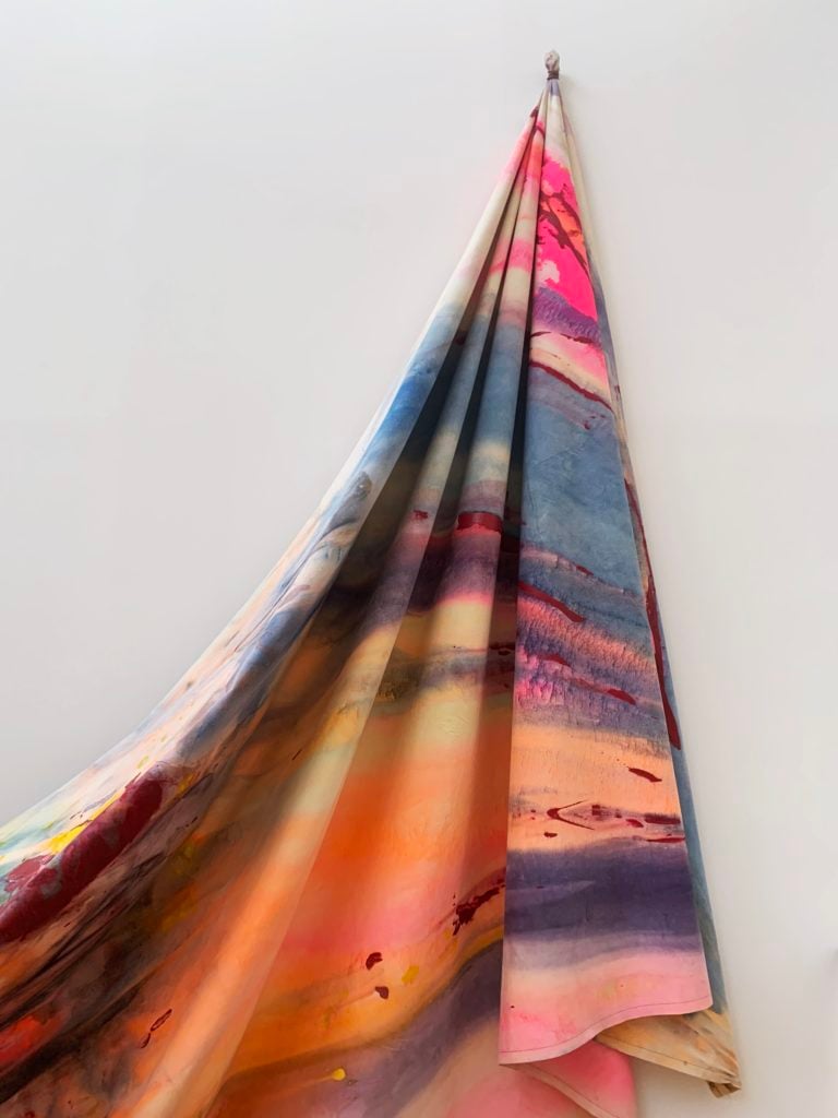
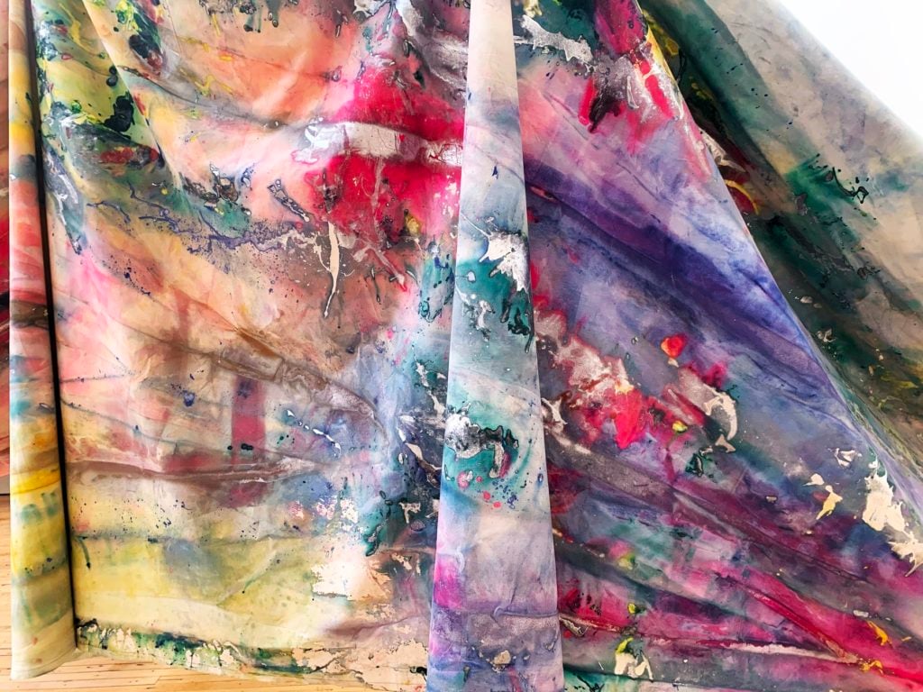
Detail of Sam Gilliam, Double
Merge (1968). Image: Ben Davis.
In this, Gilliam was both logically developing and defying the
values of the art around him at the time. Raised in Louisville,
Gilliam would discover a calling in abstract painting circles in
Washington, DC, inspired by the pleasing palettes and expansive
surfaces of painters like Morris Louis and Kenneth Noland. Gilliam
is known as a member of the Washington Color School, or sometimes as a “Third
Generation” Color Field painter—which is to say that by the time he
was trying to make his way, a long, heroic cycle of American
abstract painting was in its late stages. Gilliam remembers that
his mentors still taught art history as having a logical and
natural progression: an artist’s job was to understand the
direction of painting heretofore, and find the next natural move to
play to be successful.
Detail of Sam Gilliam, Double
Merge (1968). Image: Ben Davis.
But the ‘60s were unkind to genteel narratives of progress,
including artistic progress, which came to seem unattuned to the
gnarlier wavelengths of ascendant Baby Boomer taste. Pop Art and
Conceptual art were both in different ways reactions to the
previous dominance of Abstract Expressionism, with its lyrical and
exalted sensibility. In their various ways, they brought in the
everyday.
By the mid-‘60s, even the arch congregations of manufactured
elements found in Minimalism—marked rejections of old-fashioned
painterly attachments to composition and the “hand of the
artist”—were giving birth to what would come to be called “Post-Minimalism”: all
slouchy, perplexed surfaces and unconventional materials, the
better to cypher the sense of chaos and disintegrative mental space
of those socially turbulent times.
For that matter, the mid-‘60s transition from the Civil Rights
to the Black Power period was making very clear demands on black
artists like Gilliam for political content, and for disaffiliation
from white power structures, of which abstract painting was
sometimes thought to be one.
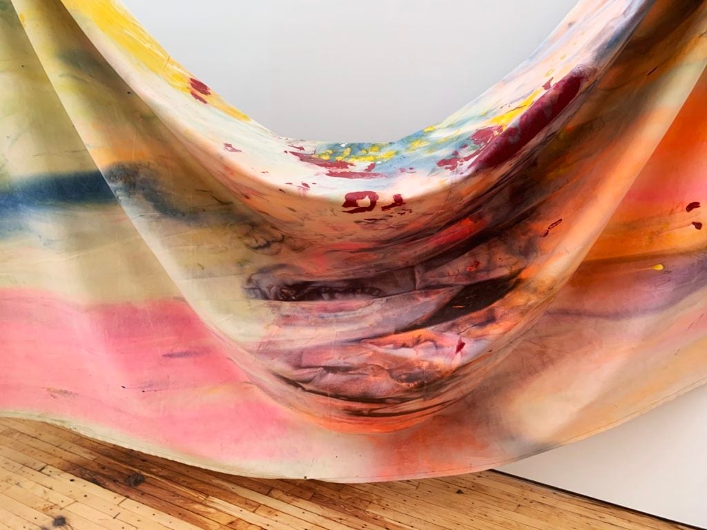
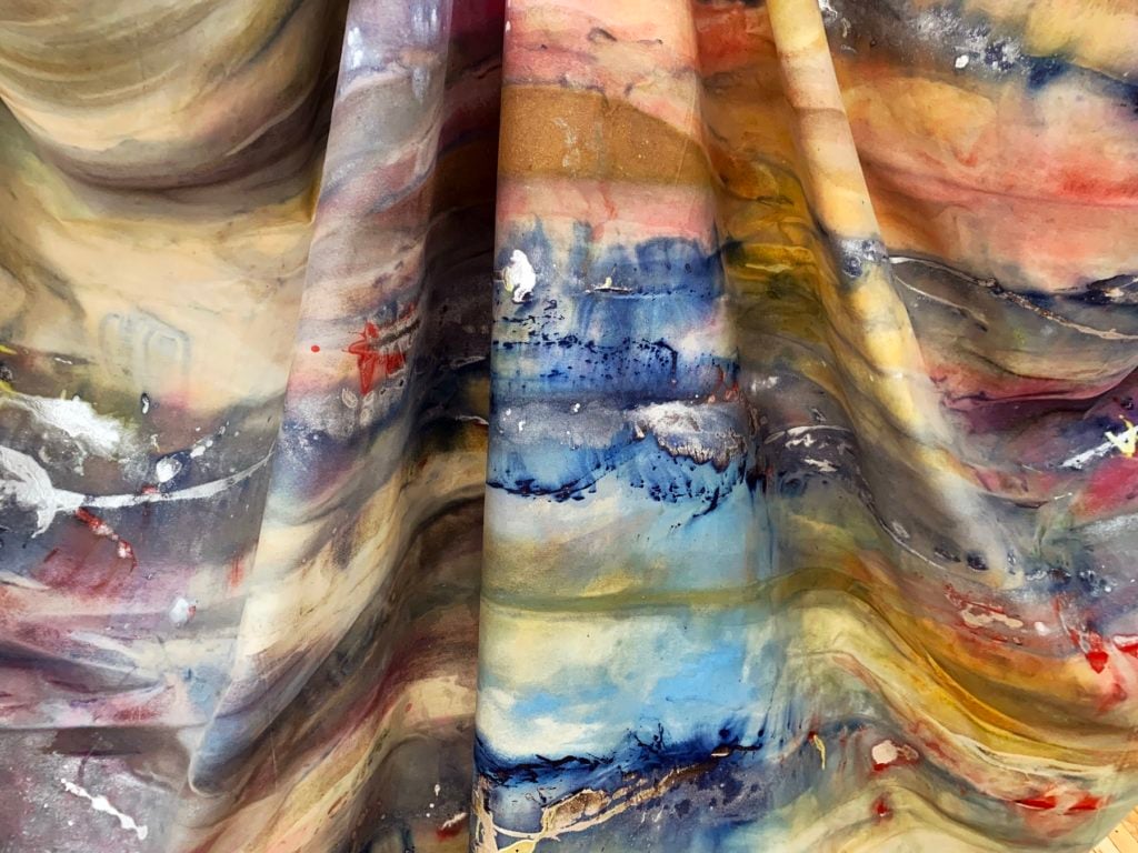
Detail of Sam Gilliam, Double
Merge (1968). Image: Ben Davis.
Artistically, Gilliam was in DC, not in New York, which was the
heart of the more overwrought and trend-setting stylistic debates.
As for political subject matter, though he would make abstract
works whose titles and atmosphere referenced the assassination of
Martin Luther King, Jr., and the subsequent urban rebellions (e.g.
April 4,
Red April), he
also had spent a long apprenticeship pursuing a love of
abstraction, and cherished its tools as a model of freedom.
Gilliam had already been working through various experimental
techniques with canvas by the time he hit on his signature draping.
Like a lot of my favorite art, his most famous invention, which he
came upon in the seismic year of 1968, summons together all the
background historical energy into a simple, potent device that
serves as both method and metaphor.
Detail of Sam Gilliam, Double
Merge (1968). Image: Ben Davis.
In his interview with the
Smithsonian Archives of American Art, along with such heroes of the
day of the DC abstract painting scene as Hans Mehring and Tom
Downing, Gilliam also mentions as an inspiration for his
“Drapes”—unexpectedly to me—Robert Morris, the New York sculptor
who bridged Minimalism, Conceptualism, and Post-Minimalism, known
for his soft sculptures and heady polemics. The classic late
defense of abstract painting, Michael Fried’s delightfully severe
“Art and Objecthood” of
1967, had slammed Minimalism—and Robert Morris’s art
specifically—for its “literalness,” its obsession with scale as a
substitute for visual interest, and its lack of commitment to the
construction of a final, achieved epiphanic image. This was a hot
debate of the day.
Look at Double Merge and you can see that all those
values that Fried is attacking as a threat to painting are exactly
what Gilliam breezily incorporates into painting with his “Drapes.”
He was inspired in making them, he says, by seeing clothes hanging
on a line: i.e. he very much meant to suggest the down-to-earth
literalness of objects in the world, resonating with the spaces of
ordinary people. As for scale, freeing the painting from the
stretcher would also allow Gilliam to embrace a new kind of
vastness.
Detail of Sam Gilliam, Double
Merge (1968). Image: Ben Davis.
Commitment to Fried’s treasured sense of painterly “presentness
and instantaneousness” also went out the window in Gilliam’s
“Drapes,” in an interesting way. An effect of working with loose
canvas is to accent the break between the original act of coloring
the surface and its final, draped form in the gallery. A
deliberate, improvisatory lack of finality is coded into Gilliam’s
“Drapes,” both in the work’s installation and in how you interpret
what is going on when you are seeing it.
“How much serendipity is there in the way folds fall?”, an
interviewer asked in
1972. “There’s a hell of a lot,” Gilliam replied.
And yet, if you go back and read Robert Morris’s 1966 “Notes on Sculpture,”
it’s not just that that text doesn’t chime fully with Gilliam’s
art, it’s almost as if Morris were directly writing against it:
“the concerns of sculpture have been for some time not only
distinct but hostile to those of painting,” Morris theorized. A
little later: “The autonomous and literal nature of sculpture
demands that it have its own, equally literal space—not a surface
shared with painting.”
It was exactly a shared space of painting and sculpture that
Gilliam embraced. And while Morris wrote, the same year as
Double Merge, of embracing entropy and randomness as
values in and of themselves, Gilliam’s process embraced such values
at one level only to use them to find a fresh way to come back at
ideas of composition and intention. While his draping suggests a
certain (literal) taking painting down a peg and embrace of a
certain “everyday-ness,” Gilliam’s works still very much flaunt the
stuff traditionally celebrated by painting: color and canvas.
Detail of Sam Gilliam, Double
Merge (1968). Image: Ben Davis.
And this brings us very specifically back to Double
Merge, because here’s something very important about its
contemporary incarnation at Dia: It is actually two works stuck
together to form a new work (both were originally called
Carousel II). That’s the “Merge” of the title.
What is the effect of this operation on you, as a viewer? At
first you contemplate the whole thing as one big, bold
installation. Then, very quickly, it asserts itself as not one, but
two distinct parts. This division is not subtle, when you stay with
the painting. One is hung close to the wall; the other comes out
from it. Both are Gilliam “Drapes.” But they are marked as having
their own logic.
At the level of their surfaces, too, the more you look, the more
they distinguish themselves from each other within the common
grammar of Gilliam’s overall technique. The composition of the left
“Drape” is airier, more diaphanous. The surfaces of the right one
are denser, punctuated with those blotches of industrial silver.
The former much more evokes movement and atmosphere, the latter
more a section of rainbow earth.
Installation view of Sam Gilliam,
Double Merge (1968). Image: Ben Davis.
For me, the title Gilliam has given to this collocation evokes
the idea of a “Double Negative.” The unique identities of
Double Merge‘s two paintings are at first cancelled out by
putting them together; but then, at the next level, their merger
also cancels this cancelling—the point of uniting them is
the juxtaposition that allows individuality to emerge once more, to
break through the mental cliché that this art is just colors and
folds, randomly distributed.
In that, Gilliam’s work at Dia tells a story, via painting, of a
specific historic trajectory that he has inhabited, looking deep
into the surrounding entropy that seemed to be canceling out the
world he loved, passing through it, and returning to a faith in
seeing things fresh. It’s a remarkably tough and subtle kind of
beauty.
The post How to Look at a Sam Gilliam Painting: With One Eye
on History and the Other on Color and Form appeared first on
artnet News.
Read more https://news.artnet.com/exhibitions/sam-gilliam-drape-painting-dia-1634428
Further reading


Leave a comment